We work with brands and causes we believe in. We help them focus their thinking, tell their stories and grow their brands.
-

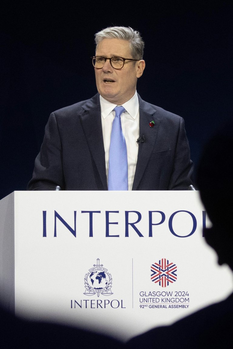
General Assembly 2024
Interpol
-

Protecting Scotland’s children
Children First
-

When you are ready
-

Quit Fighting For Likes
-

Booking, but better
Kooble
-

Caledonian MacBrayne
Every journey starts a story
-

Terrence Higgins Trust
Stigma is more harmful than HIV
-

The B Team
Time to be bold
-

Victim Support Scotland
For One Another
-

SAMH
Ask Them
-

Don't be that guy. Be a mate.
That Guy (part two)
-

Think it's different online? It's not.
Get help or get caught
-

Starting a global conversation around sexual violence.
That Guy
-

Making space for genius
T-SQUARED
-

Bringing the world’s leading legal network up to date.
Lex Mundi
-

Where learning means more
UHI
-

Showcasing Scotland as a sustainable travel destination.
VisitScotland
-

Making Scotland the centre of the cycling world.
UCI Cycling World Championships
-

Bringing five technology companies together as one.
North
-

Showcasing the potential of art school education.
Glasgow School of Art
-

Refreshing a world-leading Scottish brand.
Muirhead
-

Leaning on local history to create a new whisky brand with real heritage.
Malt Riot
-

Repositioning an architecture practice by focusing on their people.
Cooper Cromar
-

A digital platform to save our town centres.
insideOut
-

Making contemporary art more accessible.
National Galleries of Scotland
-

Building a rebellious brand story for a spirit with real spice.
Banditti Club
-

A brand to reflect modern Scotland.
Glasgow Prestwick Airport
-

Revitalising a Glasgow icon.
Glasgow Subway